QuTiP Lab Dev Log #4 & #5
This post is a summary of the work done on the QuTiP Virtual Lab for weeks 4 and 5, since last week I was out for the July 4th holiday. As a result, the application looks very different from last week, but hopefully it’s closer to the final product.
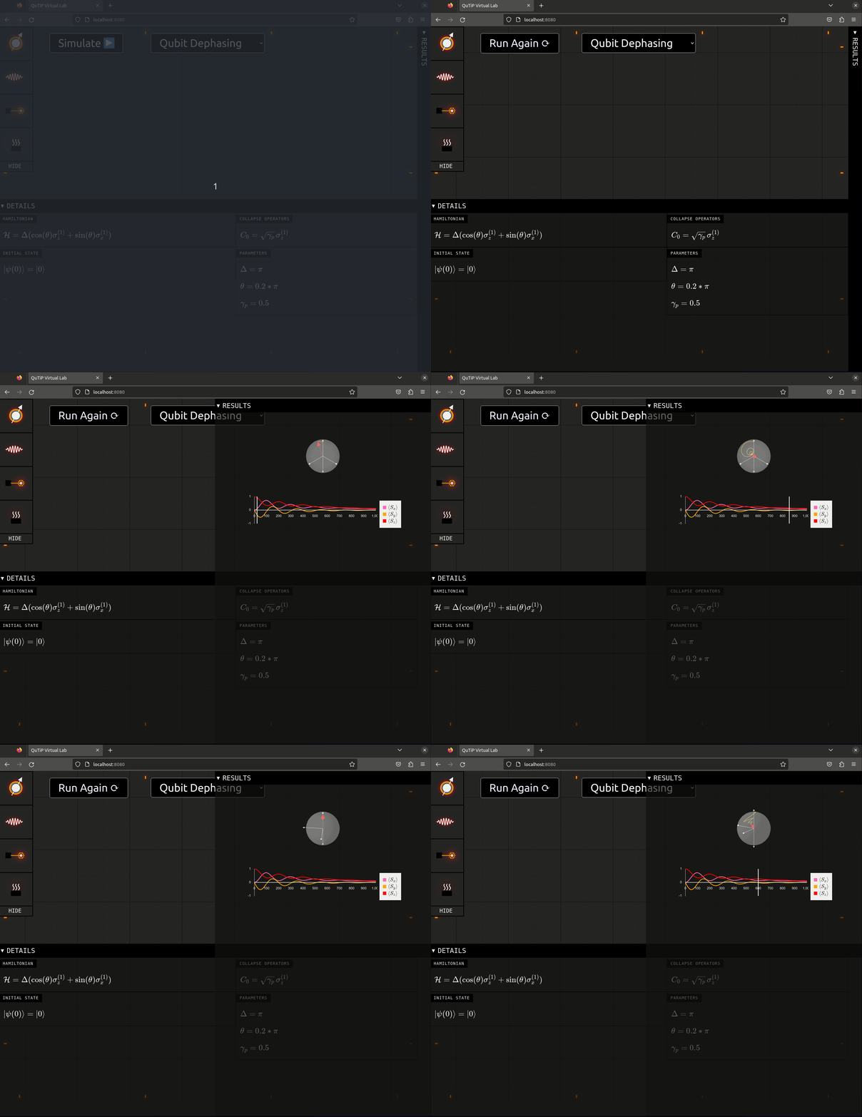
In this post, I will break down all the changes, but here’s what a demo of the QuTiP Virtual Lab looks like when simulating qubit dephasing:

Let’s break it down.
Interactive Lab
The first change was the initial pass at the interactive lab section. The idea behind this feature is to allow users to manipulate a schematic version of a quantum system by using simple actions – clicking, drag-n-drop, etc. – on graphical representations of qubits, interactions, controls, and heat baths.
To accommodate the rich interactivity and custom graphics, I started developing the feature using the react-konva library.
This library provides a React-based API for the browser’s canvas HTML element.
Because its API is based on React, all the code for drawing to the canvas is declarative, which is an improvement over the imperative Canvas API.
The upside of this is that it was fairly straightforward to develop a draggable icon for each of the system components: qubit, interaction, control, and heat bath. Here’s a close-up of the ‘tool drawer’ on the left side:

I added the ‘HIDE’ section so that the user can click on it to collapse the drawer to save space. There’s still a lot to be done here, but after getting this going, I started thinking about how someone would interact with the lab on a tablet – which brings me to the next major change in the UI.
Collapsible Panels
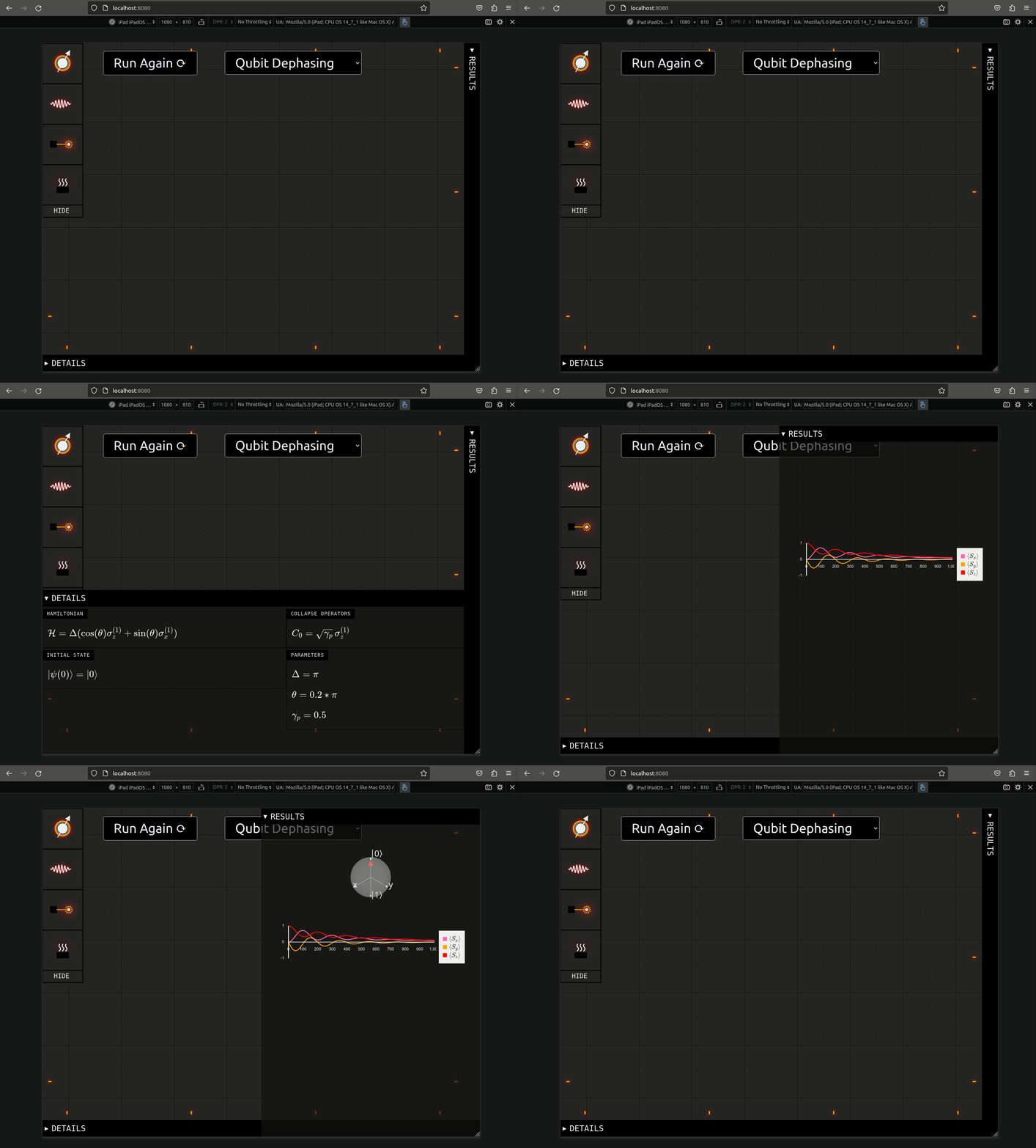
One of the goals of this project is to allow students to access the virtual lab on tablets. This means that the UI needs to take into account that the device the app is running on may be limited in terms of screen real-estate. With this in mind, I changed the structure of the UI so that the Details and Results panels can be collapsed. This should allow us to give each section a decent amount of spacing even on smaller screens. Here’s what this looks like on an iPad’s viewport

Actually implementing this was really easy, I just used two HTML elements – <details> and <summary> – and a little bit of CSS.
Simulate Button & Demo Selection
With the collapsible panels in place, it didn’t make sense to keep the main Simulate button on the Details panel, so I changed it to stay top and center of the UI.
I also added a drop-down with a list of preset demos for first-time users to play with. Right now it only holds two such examples – Larmor Precession and Qubit Dephasing – but it’s relatively trivial to add more to the list later.
Line Graph of Results
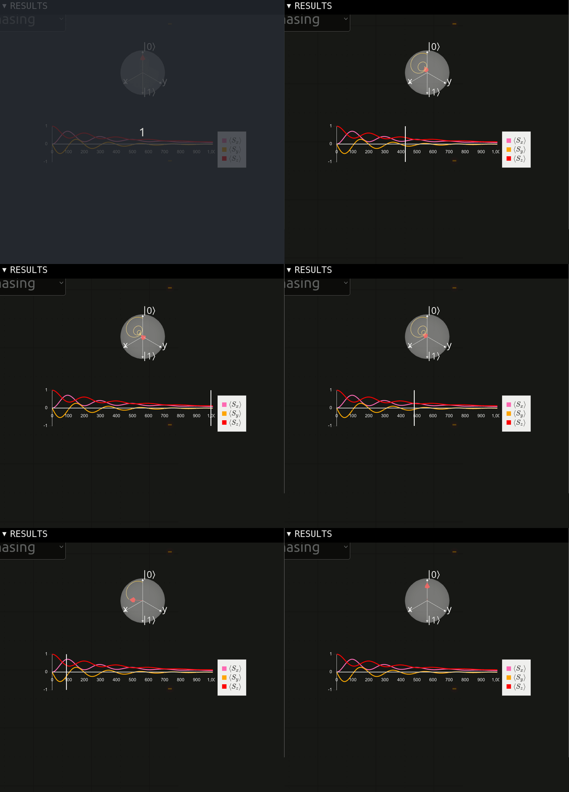
Finally, the last major change is the addition of the line graph to the Results panel. There is a great plotting library named d3 that can be used for producing dynamic data visualizations in the browser. However, its API is imperative, which makes it difficult to integrate into a React application. Fortunately, Airbnb has made a React-based library for d3 called visx. The library made it easy to produce a plot of the Bloch vector components as a function of time, which complements the 3D Bloch vector visualization above it. I took advantage of React’s state management API to implement a link between the two components, so that when the user hovers over a point in time on the graph, the 3D visualization updates the Bloch vector to that point in time:

Next Steps
There’s still a lot to be done, but next week I hope to focus on the UI for building the quantum system. It’s possible that drag-n-drop is not the best UX on tablets, so I may need to refine the tool drawer idea before proceeding. Also, it might make more sense to have a multi-click flow for placing interactions between qubits – i.e. select one qubit, then the other, then select which of the possible ways they could interact.
Comments